My Work Apps are So Crap: Flaws in Workplace Design
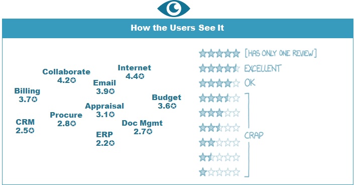
In the lead up to a digital transformation conference I hosted recently, I talked to about a dozen heads of HR and Technology asking them about their ecosystem of work? Specifically, what star-rating would their teams give each of their most commonly used workplace Apps? The answers weren't unexpected but still a bit disturbing.
Work Performance in a 3-Star Ecosystem
The off-the-shelf products like email, web browsers and collaboration tools usually get a solid 4-Star rating or better. But ask about billing and finance, time-sheets, HR, purchasing, contracts, help desks, document storage or compliance ...and the story gets darker. Many are 3 star apps. Some are 2 star or even worse.
Why are the apps we use to get our work done so far below those we buy for our smartphone or home computers? Would you give a trades-person a toolbox of dodgy tools and ask them to build a house?
As part of a recent workplace-of-the-future program, I asked different user-groups to talk about their own experience of Work+Technology. For each group it took about 5 minutes to find out:
Just how hard it is to complete key daily tasks in that company
Which App nearly everyone hates ...there is always one, in every company
Who each App was designed for ...often the team that funded it, not the users.
Workplace Design Is Often Decades Behind Customer Design
After running a few feedback sessions, a handful of design themes began to emerge across multiple workplaces. This is how users describe them:
People express a sense of frustration and being powerless in a system of work that is rarely designed for them. Surprisingly leaders express even more frustration (some openly hostile) citing extra hours at their desk each week needed for online approvals & management oversight tasks.
Further discussions shows these design standards aren't unique to software - they are the same thinking used to create most workplace tools, policies and process.
The Growing Gap between Customer and Employee Experience
As digital-customers outside of work, people have embraced the slick transactions on offer at sites like Amazon, Apple or Uber. They get seamless interfaces and an array of options plus an environment where user-experience and crowd feedback is visible and acted upon.
But in the workplace, people are subject to a software delivery model that doesn't even treat them as the customer. Mistakenly, many project teams treat the paying business unit (say Finance, HR or Purchasing) as the software-client, not it's users.
Aside from companies with mature agile or design capabilities most companies still struggle to bring the user into design in a meaningful way. For example:
For New Apps: Users have no say in project acceptance. What project managers call 'User Acceptance Testing' is mostly aimed at checking contracted functionality has been delivered right before go-live.
For Existing Apps: Few organisations allow people to openly rate Apps once in operation. Crowd reactions are never made public as tangible score or ratings.
So the gap between employee and customer experience continues to grow.
Half of the Workforce feels Ignored in Digital Programs
PWC's Tech at Work survey shows that only half the workforce believes their company pays attention to their needs when introducing new technology. Given that technology-based change is rising sharply in almost every industry, what reactions can we expect on new software from these disgruntled users whose needs are ignored?
Project success rates haven't materially improved over the last 10-20 years, regardless of expert change management frameworks, practitioner certification training, expensive change-teams or forceful 'no choice' change tactics.
It's time to really examine how software impacts on the users 'day in the life' and then set about configuring or purchasing software to complete the necessary tasks AND deliver tangible benefits for users.
Designing for Better Workplaces
Those user groups I referred to have surprising simple requests of new software.
They merely want:
Make it intuitive and simpler to learn;
Reduce time to get tasks done (this one is often ignored);
A few features just for 'me'.
Best Places to Work
Creating great workplace doesn't need to be complicated. There are some simple fixes
Give the users a voice: Whether you are using IDEO design tools, agile development or co-design methods, bring users in at the design stage if you want them to embrace your product at the end of the project;
Give people back the right to vote: Introduce a bit more democracy into your software development. I guarantee that having users publicly rate each new software product will do more for a design culture than years of training, governance or policy change. Just giving them a platform to have a say is a breakthrough for many companies.
Reflect on recent projects: Involve the users in a retrospective on projects delivered in the last 2 years, to identify your best and worst projects for users. Treat it as a learning exercise rather than witch-hunt and apply the 'lessons learned' to your current projects.
Please share your experiences. I would love to hear your own stories on your workplace design culture.
[Article originally published on LinkedIn, April 2019]
--------------------------------------------------------------------------------------------------------------
Damien writes regularly about people at work and how we change. He strives to create better Australian workplaces through his company RethinkHR. He has a passion for people, evidence-based practices plus fresh thinking and design.


